Tech for the digital natives
The digital installations at Tate Modern’s new extension not only show previously hidden treasures, but also appeal massively to a young audience, says Adam Jenkins.
Too much of the world’s greatest art is stored away out of public sight. A recent Quartz survey revealed that our largest art galleries “typically display about 5% of their collection at any time”. Bucking the trend is Tate Modern. With its new Switch House extension it has devised a cunning way to share hidden treasures using hi-tech and ultra-creative digital installation.
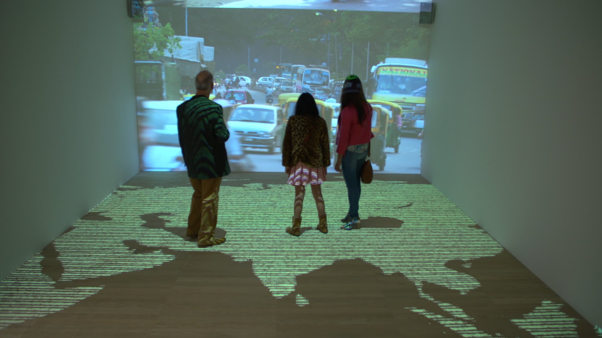
Switch House’s International and Performance Rooms present videos of archived artworks, performances and interviews as digital projections. But this footage isn’t simply thrown up on to a wall. Instead, the films are displayed in a way that demands attention.
When most of us can carry a screen in our pockets, it takes more than flat static projections to capture imaginations
In the Performance Room, footage of performance art is triggered by motion sensors, the idea being that the viewer’s ‘performance’ (or motion) elicits the artist’s performance. This form of mirrored interaction is a great way to get people more deeply involved with the concept of performance art, while also giving precious exhibition space to work from a genre that doesn’t normally fit in galleries.
In the International Room, viewers are immersed in a projected, graphically designed image of the world that dramatically disintegrates, spins and reforms on the location of an international artist like Ai Weiwei. This ‘arrival’ then triggers vast projected clips of the artist explaining their work.
The resulting installations use state-of-the-art tech to present archive footage of artworks in a way that allows people to curate their own experiences. How else to draw attention in a space that is already bursting with must-see art?
Driving engagement
Both rooms are examples of hi-tech creativity driving digital engagement. If the videos were basic projections, chances are the majority of people would walk on by. We are now immune to the charms of a simple 2D projection because it’s a display mechanism that is over a century old.
When most of us can carry a screen in our pockets, it takes more than flat static projections to capture imaginations. As we become increasingly addicted to these screens and the digital worlds they open up, it becomes clear that digital is a good starting point for institutions wanting to drive engagement, especially if they want to attract the future generation of art connoisseurs, the ‘digital natives’.
So it was smart for the Tate to commission a project that not only gives exhibition space to otherwise unseen works, but also generates deeper engagement. By creating fun, innovative and educational ways to ensnare viewers, this new breed of dynamic digital presentation could be what hands galleries a chunk of the attention that people otherwise devote to their phone.
It’s a scenario perfectly illustrated by the viral picture of kids engrossed in their phones, rather than the Rembrandt masterpiece that adorns them. Okay, so the photo was slightly misleading because the children were using their phones to research the painting. But it’s still a tale of our times, highlighting how technology is a huge distraction.
Perhaps that’s why the hi-tech showcasing of artworks is increasing. It’s not just the Tate brand that’s starting to embrace technology. Cleveland Museum of Art’s Gallery One digitally displays artworks in an interactive way to give them more context. The Google Cultural Institute project uses virtual reality (VR) to transport you into a Pieter Bruegel painting. Similarly, the Dali Museum’s Dreams of Dali gives a VR twist to an old classic.
The dangers of tech
So far we’ve only scratched the surface. As technology develops, so too does the creative opportunity for presenting old art in new ways. That said, tech for tech’s sake is dangerous.
Some technology, like the iPad, is so beautifully intuitive that an 18-month-old child understands it. But projects that lack this simplicity can be daunting and impenetrable to the uninitiated. Tate Modern has to appeal to everyone from two-year-olds to 92-year-olds so its digital installations need to be inviting, not intimidating.
Its Timeline of Modern Art combats this problem with inviting intro graphics that gently lead into more multi-faceted interactivity. It takes complex technology and planning to make something so hi-tech seem so simple and welcoming. If you don’t invest in this level of thought and design, best not to bother at all.
Thorny cost issue
Which brings us to the thorny issue of cost. These installations are not cheap so they may not currently work for institutions with smaller budgets. But because technology becomes more accessible and affordable as it develops, niche galleries will soon create their own versions of Tate Modern’s Performance and International Rooms. The only limits will come from our imaginations, not our budgets.
Digital display of artwork is changing the way people exhibit, sell, learn about and engage with art and is rapidly becoming a differentiator that helps galleries stand out. It also increases interest and footfall, which ultimately generates return on investment, thus satiating the corporate bigwigs as much as the innovators.
Adam Jenkins is Executive Producer of Labs at Framestore.
framestore.com/labs
Join the Discussion
You must be logged in to post a comment.