Accessible interpretation
An interactive guide to Kettle’s Yard’s collection is engaging a wide audience online. Lucy Wheeler shares what she had learned from the project.
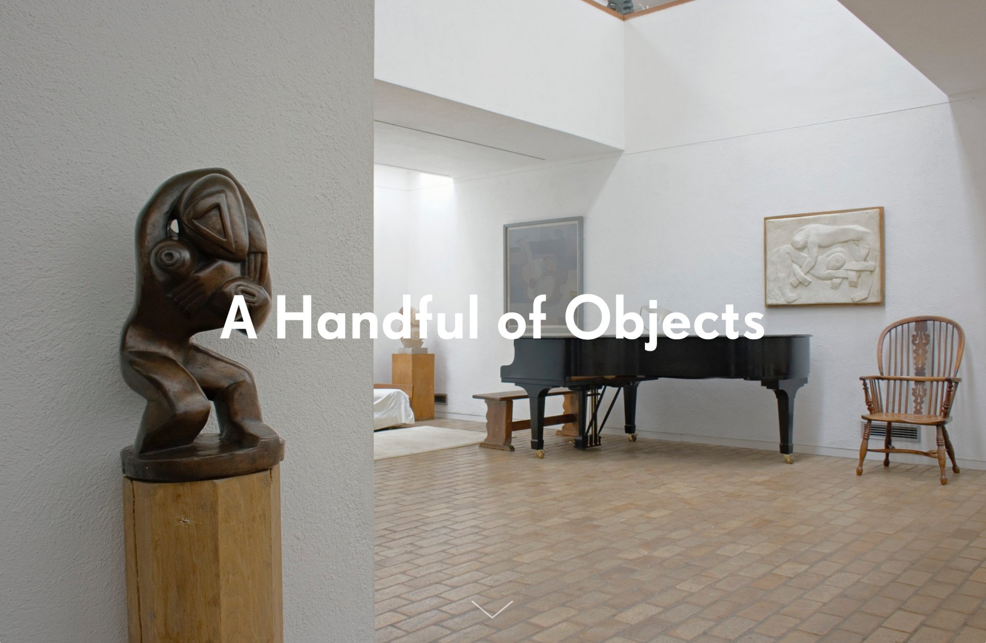
Earlier this year Kettle’s Yard launched A Handful of Objects, an online resource giving viewers the opportunity to explore the context and significance of five objects through film, sound, images and 360° views.
Throughout the resource there are options to share information via social media, as well as inviting people’s thoughts and comments about the artworks themselves. Since launching, the resource has had over 7,000 views, with the average session lasting 3.57 minutes (compared to 1.42 minutes on the main website).
We wanted the resource to avoid art history jargon and assumed knowledge, offering instead bite-size information with glossaries for art terminology
The resource was developed for our less specialist visitors looking for an accessible interpretation of the collection. In the house at Kettle’s Yard there are no labels, but interpretation is available from the visitor assistants or from the house guidebook. While both of these sources of interpretation are good they are not right for all visitors, and for those new to the house it can be a bit overwhelming.
The resource was planned and developed collaboratively with our learning, curatorial and marketing teams. In the process of developing the resource and researching what online museum interpretation already existed, we identified some common pitfalls: assumed knowledge, poor usability and confused branding. Below are some insights and recommendations to tackle these problems.
Know your audience
A Handful of Objects is primarily aimed at adults with an interest in art, but who don’t consider themselves specialists. Drawing on audience research, we know that only 15% of our visitors would identify as having specialist knowledge of our collection.
So from the outset we wanted the resource to avoid art history jargon and assumed knowledge, offering instead bite-size information with glossaries for art terminology. Analysis of user patterns on our website demonstrated that visit duration is short and sporadic and interactive elements such as film and 360° views of objects would help to hold user’s attention.
Act on consultation
Our user group, made up of teachers, youth workers, volunteers, Friends of Kettle’s Yard and regular participants to our programme, was consulted early on in the process of developing the resource. They suggested that we use a question-led format to avoid assumed knowledge. Questions span from contextual questions and general curiosity such as ‘How do you keep this object clean?’ to ‘Why is it special?’.
This allowed us to look beyond the predictable art historical interpretations of objects. Working with geologists, artists and conservators, an alternative ‘way in’ to the objects was created. The session further revealed how frustrating it can be to use confusing or poorly designed apps, as well as the importance of compatibility with desktop, tablets and smartphones. This all fed into our design brief.
Look beyond the arts sector
We also looked into which online interactive sites are already successfully dynamic and easy to use. In the early research stage we discovered that online consumer fashion and sports brands offered the dynamism and clean usability that we were striving for.
They included easy-to-use zoom features, 360° views of products, embedded video and sound content and the ability to share. Building up a bank of examples of resources helped to realise the look and feel that we wanted.
Prepare a detailed and clear design brief
From consultation with our user-group and internal meetings, it was stressed that the resource should maintain our branding and remain true to the look and feel of the house where the main collection is held. It was critical to find the right web developer, given this ambition.
The procurement process involved meeting a number of developers, armed with a clear understanding of what we hoped to achieve and questions about what was possible. The solutions helped us to choose the right person for the job and to subsequently build the ideas that had come out of those initial meetings into the design brief.
When writing a brief for a web developer, it is critical to provide a clear framework for the project, outlining exactly what you want to achieve, such as to work on multiple platforms, to be modular and expandable and to be editable.
Think about testing and evaluation
It was important to develop a timetable that allowed for internal consultation on initial designs, and external consultation via a test site. There is always going to be snagging, edits and changes to online interactive content so make sure there is time factored in for this crucial stage.
As well as users having the option to share and comment on the resource via social media, a feedback option was integrated into the site collecting qualitative and quantitative information from our users. We hope to add more artworks in future and we will take feedback into account as we continue to adapt and improve the resource.
Lucy Wheeler is Assistant Education Officer at Kettle’s Yard.
www.kettlesyard.co.uk
Tw: @kettlesyard
Join the Discussion
You must be logged in to post a comment.